http://www.loc.gov/pictures/collection/thc/item/thc1995000053/PP/resource/
This image is very pleasing to look at for many different reasons. The first thing that draws my attention is how the trees frame the landscape and give it balance. The piece of land with trees jetting out and the Capitol in the background give it three dimentions which further draws you in. The contrast of the black and white image also ad to it.
Monday, February 24, 2014
Tammy Kelton
I loved this photo. There is so many leading lines your eye follows the road into the photo and then your eye tends to travel in and out of the photo. I like the composition of this photo. It give you a feeling that it is peaceful. I want to travel to this place and just spend time outside to photograph the entire area. It also leaves you with a feeling that it is a cold place. Maybe even a lonely feeling.I like the use of lighting. the house being darker in contrast give a since of lonely dark place. Yet in the back ground it in lighter and leaves you feeling like exploring the region. And the use of foreground framing adds depth to the photo.
Can't pick just one.
http://www.loc.gov/pictures/collection/kskm/
This is the Kandell collection. It is full of portraits, landscapes and still life photos of daily life in Sikkim as well as special events. I had trouble picking just one photo from this collection to share. I think this one labeled : [Prince Palden (second from left) making silly faces with friends, Sikkim] is one of my top favorites. It shows a royal acting like a regular kid (although I can't say more about the monachy of Sikkim to be sure of how strict the royal family would be about pomp and circumstance at his age in the photo). This fun portrait shows the friendship between the boys by their proximity. Also, they all seem to share a sense of humor. It shows the universality of "making silly faces". The boys are arranged in a tight triangle. The Prince isn't dressed as colorfully as his friend or even taking the position in the triangle one would expect a prince would.
 Another photo is this one of a woman churning yak butter tea :
 I love that she seems to enjoy it. The motion blur is just enough to show the activity, while keeping the rest of the photo in good focus.
This is the Kandell collection. It is full of portraits, landscapes and still life photos of daily life in Sikkim as well as special events. I had trouble picking just one photo from this collection to share. I think this one labeled : [Prince Palden (second from left) making silly faces with friends, Sikkim] is one of my top favorites. It shows a royal acting like a regular kid (although I can't say more about the monachy of Sikkim to be sure of how strict the royal family would be about pomp and circumstance at his age in the photo). This fun portrait shows the friendship between the boys by their proximity. Also, they all seem to share a sense of humor. It shows the universality of "making silly faces". The boys are arranged in a tight triangle. The Prince isn't dressed as colorfully as his friend or even taking the position in the triangle one would expect a prince would.
Library of Congress- Daguerreotypes
Hayley Vrana
http://www.loc.gov/pictures/collection/dag/

This daguerreotype is of the Editorial staff of the New York Tribune. Daguerreotypes were mostly portraits because of the slow shutter speed, but this collection also has some outdoor views. I chose this type of picture from this section because last semester I took a History of Photography class and we went into great detail over these types of photos. This picture really amazes me because there are seven guys in it. You usually see one or two people in a daguerreotype because of how slow the shutter speed was, but to have seven guys keeping perfectly still is very neat. I also just like seeing old photos and how different the times were when photography was first coming around.
In Daguerreotypes it's funny to look at all the different expressions on each of the guys faces. All of the guys have completely different looks from bored to staring off in space looks.
Hayley Vrana
http://www.loc.gov/pictures/collection/dag/
This daguerreotype is of the Editorial staff of the New York Tribune. Daguerreotypes were mostly portraits because of the slow shutter speed, but this collection also has some outdoor views. I chose this type of picture from this section because last semester I took a History of Photography class and we went into great detail over these types of photos. This picture really amazes me because there are seven guys in it. You usually see one or two people in a daguerreotype because of how slow the shutter speed was, but to have seven guys keeping perfectly still is very neat. I also just like seeing old photos and how different the times were when photography was first coming around.
In Daguerreotypes it's funny to look at all the different expressions on each of the guys faces. All of the guys have completely different looks from bored to staring off in space looks.
Library Of Congress: Sikkim Photos

Dr. Alice S. Kandell gave over 15,000 images to the library of congress in 2010. A selection of around 300 of them, which are included in the "Prints & Photographs Online Catalog," show the lives of the Sikkim Kingdom in the high Himalayas. She took the photos in the late 1960s and early 1970s. The photos show a culture that is slowly diminishing.
I enjoyed looking at this entire collection and had a difficult time picking out just one. The photo above is titled "Reincarnation of a holy lama takes a break from his reading. He holds a prayer book covered in wood." I've always found it fascinating how young the holy lamas are and what their lives must be like to be raised and live their entire life with that mantel. I also enjoyed the composition and candid nature of the photo above. Dr. Kandell had special permission to take these photos and get some pictures outside of the typical more formal shots you'd see.
Taking photographs that few have the chance to take, documenting something that is fading and may soon be gone, adventure in new and foreign lands... these aspects of the photos all interest me. It is interesting to look through the collection and see where modern amenities are slowly working into the culture. I wonder what it looks like now? 40 years later.
Technically, I think of the great feat it is to get a photo in film without the instant feedback of our digital cameras and the range of equipment that is readily available to us now. I see some minor composition changes I would make to the photo above in the digital darkroom, but I think she hit the exposure spot on. It could have been posed, but looks like it was something you really would see even if she just said "wait, stop right there" while she snapped the photo.
http://www.loc.gov/pictures/collection/kskm/
Library of Congress: World War I War Poster, 1917.
by John Anthony Muth
This poster shows a marine in uniform marching along a dock with ship, fort and city skyline in the back ground. I really love old graphic art because it usually is woven with color and design qualities that are not as preferred in today's modern advertising campaigns. The bright warm yellow is the first thing that captures the viewers eye which is in sharp contrast to the dark and light blue uniform of the marine's uniform. The dominating primary colors grab the viewer and the simple use of overlapping draws the viewer in. Combine that with the direction of the smoke and the marines march which leads the viewer directly into the slogan "SEVICE ON LAND AND SEA." I believe this is an excellent example of a advertising poster that typifies the future of war posters in World War II, with emphasis on design and color to capture the viewers eye and create an emotional response.
http://www.loc.gov/pictures/resource/cph.3g09855/?co=wwipos
Friday, February 21, 2014
Paseo del Prado, Habana

http://www.loc.gov/pictures/resource/det.4a31854/
This photograph is part of a series of photographs that were taken c1900 in and around Havana Cuba. I Googled the street name and city and found some photographs of this street in modern day. The feeling is still there, but it is, of course, much more modern with paved streets and a large cement walk down the middle that has been poured around the trees.
This particular photograph caught my eye for several reasons. It's an outdoor photograph and I definitely lean toward that type of photography. The coloring is both beautiful and intriguing. Because the colors are mostly pastel, (which is usually NOT a color palette that I favor) the photograph looks like a watercolor painting to me and the beautiful deep green of the trees is a wonderful contrast to the soft colored buildings. The vanishing point of the sidewalk together with the row of trees leads my eye into the photograph and then makes me want to keep walking through and see what's at the end of the street. I love the texture that is represented in the ruts of the dirt road, the bark of the trees, and the architecture of the buildings. In addition I love how even though the buildings on the right look very similar to one another - the round columns out front, the height of the buildings is similar, most of them have second story windows - they are individual in their own right. They are painted different colors, the architecture of the second story windows is different for each, little details have been added to make each one stand out. This shows to me that the people in this town, or the people that owned the buildings, took pride in their surroundings and cared enough to make sure the building they were in charge of looked as good as it possibly could.
I would love to walk along this street or sit on one of the benches under the canopy of the beautiful shade trees. This photograph is peaceful to me.
Wednesday, February 19, 2014

Music has always been an essential part of human life, from
singing to playing all kinds of musical instruments. This photograph is very
striking and there is a level of humanity attached to it and it looks like an
image from the 50s or 60s. The man is either sitting out on the porch of his
run down house or he is working on the house. Either way, he finds time to play
his guitar to feed his soul after a hard days work. I find this image to be an
uplifting image because it points to the fact that regardless of what’s going
on around “one” there is a always hope. The photograph has beautiful lights and
shadows. The shadow on the door emphasizes the “darkness” in the house. The
steps are falling apart, the man’s shoes look warn and the bucket or basin all
together describes a lifestyle. The rule
of thirds is evident in the composition of the photograph. The man sit at the
left third and also the bottom third of the photograph.
Wednesday, February 12, 2014
Line, shape, form - Justin P.

There's something about the human body that intrigues me. For this project I'm going to take shapes made from the body to create a larger picture. Probably not going to use any butts like the photo above, but it does give you an example of how you can create lines and shapes with the human body. Also, having a human person to photograph it is easier to create those shapes because they can move and understand you, unlike plants and animals.
http://char.txa.cornell.edu/language/element/form/form.htm
This is my second attempt at posting on this great article on Line Shape and Form.
This article uses some interesting language, it calls shape "2D form". The author also points out the differences between organic and geometric as well as realistic or naturalistic as opposed to abstract. The article got me thinking about the photos I had taken for this assignment and how I have both natural and geometric shapes, and how I could combine them or contrast them in the work. Also the article points out the importance of the shadows and negative space, which influenced the way I have shot pictures since reading the article. In rereading the post and article I remembered that in the first post I had mentioned that the article also mentions the use of Perspective, negative space, and lighting and shadow to create different tones and evoke different feelings even of the same subject.
Tuesday, February 11, 2014
LINE, SHAPE, FORM - Darcie Naylor
 |
http://www.digital-photo-secrets.com/tip/2776/visual-design-using-shape-in-photography/
This website has given me some more ideas to use in the upcoming project on line, shape and form. I especially loved this photo of a small stalk of foliage. The way the smaller "leaves" curve around themselves mimics the way the overall stalk curves. I also love the way the lighting in this photograph highlights the stalk and their colors. The author of the piece tells us that "Sometimes you need to become a viewer in order to become a better photographer." I know that in my busy every day life I fail to notice the details that surround me. I hope this assignment will help me be a better viewer.
Line, Shape, Form: John Anthony Muth
http://webodysseum.com/art/extreme-close-up-of-human-eye/
This photo inspires my scientific side, to understand the universe in terms of it's physical nature. The complexity of the human eye is amazing and beautiful. The lines, shapes and rhythms of the eye provide for a very interesting composition which brings the viewer around the entire pupil in circular fashion.

Monday, February 10, 2014
Brainstorming for Line/Shape/Form Hayley Vrana

I like how simple this picture is to take, but includes lines from the walls and the sidewalk, to shapes from the signs and the squares in the sidewalk. I also found a website that defines in photography the way shape and lines are used, which I think is very useful.
http://photoinf.com/General/NAVY/Shapes_and_lines.htm
Line, Shape, and Form
I found this website in my internet research on line, shape, and form.
http://dailypost.wordpress.com/2013/09/17/shape-line-texture-pattern/
Unfortunately, I missed class on Monday, but the class probably discussed many of these methods for photographing lines, shapes, and forms. I like the suggestions she makes to help bring out a shape you're trying to capture in a photo. Such as back lighting to bring out the shape in a silhouette or her suggestion to shoot upwards and use the sky to outline a subject. She also discusses texture and pattern in this article and leaves out form. It made me think about them each in more detail and compare what they each are. Some of the sketches and drawings I also saw during my research made me think of line, shape, and form as adding a dimension with each. A line being only 1D, shape... 2D, and form having 3D.
Sunday, February 9, 2014
Line, Shape, Form
thought this was a cool short video showing line, shape, and form. Loved how the focus changed on each subject matter in the video
Line Shape Form brainstorming

For the line, shape, form project I am thinking of photographing architecture like this...hmm.
Strong Composition


Wednesday, February 5, 2014
Strong and Fascinating Composition - Justin P.

http://flic.kr/p/jKv7cy
I love the leading lines from the river and the path. When you're eye follows the leading line of the path you catch this dog near the beginning. It also demonstrates the rule of thirds by when you follow the lines you end up in the right third. There's also repeating vertical lines from the trees on the left and a diagonal line from the top of the trees leading you towards the end of the river.
Strong and Fascinating Composition

I first saw this picture a couple of years ago while looking for photography contests. This was the winner for the PopPhoto.com December 2009 monthly contest. I couldn't find it on the PopPhoto.com website again, but I did locate it on Model Mayhem with a Google image search. Although it is slightly different on Model Mayhem than the original I downloaded from PopPhoto.com. I also found others in the series on Model Mayhem.
Too me, this photo defies gravity. This illusion comes from the strength of the model and photo. Even though I don't believe there was any "manipulation" to the photo, it seems almost impossible. Like she is being pulled or drawn someplace to the right. I see a lot of strength in the leap. Her toes and feet still look tense from the launch, but her hands and torso look relaxed as though she is being lifted unconsciously and gravity is going sideways. Her hair and the circle of talcum powder, show me the line in which she used to throw her head, but the hair itself seems to almost fall in with gravity going sideways. I like the curves and lines to the photo. Her presence and strength is magnified by the extension of line in the powder. I find strength and masculinity in the "C" shape of her body, but at the same time see a more soft and feminine "S" shape created with the extension of highlights in the the powder and her back. Similar to Tammy's smoke photos, lighting up the powder makes something big out of many small things. I think of this photo often when I think of photos I'd like to reproduce once I have some good strobes.
Monday, February 3, 2014
Fascinating and Strong Composition -Hayley Vrana

http://shotrockers.com/10-steps-for-better-landscape-photos-photo-tip/
This picture is an excellent example of strong composition of photography. Symmetry is shown from the two mountains on both sides and the river in-between. Also the mountains and river are leading lines, making your eyes look toward the clouds and the background. This photograph has an amazing range of tones from white to black. I really like this photo of the Grand Canyon because of the lighting and the texture. The way you can see the sun behind the clouds gives a very warm feeling to me.
Saturday, February 1, 2014
Strong/Fascinating Composition - Feeling blue today
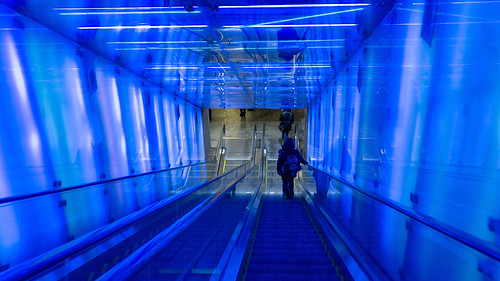
https://www.flickr.com/photos/mona_oslo/12189564045/
I think there are several factors which contribute to this picture's strong and fascinating composition. There are the lines from the corners which lead the viewers eyes to the bottom of the escalator, there are several repeated shapes which imply more lines. The color blue is used, for me it has a calming effect. Then there at the bottom of the escalator are the floor tiles. I really had to look up composition and the "tips" for stronger composition to know what to look for on this assignment.
Subscribe to:
Posts (Atom)